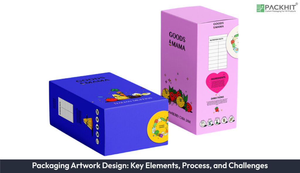
Packaging artwork design creates and prepares visual assets, color separations, dielines, and print-ready files for product packaging. It emphasizes 5 elements: visual assets (logos, 300 DPI photos), typography (primary and secondary fonts, outlined or embedded), color formats (CMYK for photographic panels, PANTONE for spot matches), file preparation (dielines, 3–5 mm bleed, 5 mm safe zone, PDF/X-1a, 300 DPI), and substrate/printing method (corrugated, flexible film, folding cartons, rigid setup boxes).
The artwork workflow moves from initial concept development through artwork preparation, proofing, and final production approval. However, challenges such as color inconsistencies, file errors, and proofing delays can affect quality and timelines, requiring strict adherence to technical guidelines and effective team collaboration. Emerging trends like eco-friendly materials, smart packaging technologies, personalized designs, and hybrid printing methods are reshaping the landscape, pushing brands toward innovation, sustainability, and enhanced consumer engagement.
What is Packaging Artwork Design?
Packaging artwork design refers to the process of creating and preparing visual assets for product packaging. These assets include logos, typography, images, and other design elements that are formatted to meet the technical requirements of printing processes.
Key Elements of Packaging Artwork Design
Five core elements determine packaging artwork quality: visual elements, typography, color formats, file preparation, and substrate/printing considerations.
Each element carries measurable constraints that affect production, cost, and the finished package on the shelf.
- Visual Elements: Include logos, product photography, icons, and decorative patterns. Use vector logos for scalability and provide product images as 300 DPI TIFF or PSD files with isolated backgrounds whenever possible. Maintain consistent brand assets across all packaging designs.
- Typography: Define primary and secondary fonts for clear information hierarchy. Use display fonts for product names and simple sans-serif fonts for instructions and detailed information. Maintain a minimum font size (often 6 pt for body text, depending on your printer/substrate/spec. Outline or embed fonts in final print files to prevent substitution issues.
- Color Formats: Use CMYK for four-color process printing and PANTONE (PMS) colors for accurate spot-color matching. Use CMYK for photographic images and PMS colors when consistent brand colors are required. Always verify colors using physical proofs on the final packaging substrate.
- File Preparation: Prepare print-ready artwork with dielines, typical bleeds (often in the 3–5 mm range, per dieline/spec, 5 mm safe zones, proper trapping, and 300 DPI resolution. Flatten transparencies, convert colors to the required format, outline or embed fonts, and export final files as PDF/X-1a with editable AI or EPS source files.
- Substrate and Printing Method: Select packaging materials based on product protection, functionality, and visual requirements, such as corrugated board, flexible films, folding cartons, or rigid boxes. Choose digital printing for short runs, offset printing for medium runs, and rotogravure printing for high-volume production. Select finishes such as matte, gloss, aqueous, or UV coatings based on the desired appearance and performance requirements.
Practical checks: proof color on the target substrate when possible, verify dieline fit against the finished structure, and convert spot-to-process only after a visual match test. Small layout shifts of 1–3 mm can cause misregistration; confirm trims before plate-making.
What is the Packaging Artwork Design Process?
The packaging artwork design process is a structured workflow that ensures the creation of high-quality and functional packaging. Below is a breakdown of its key stages:
1. Conceptualization
The process begins with conceptualizing the design based on the product’s branding, target audience, and functional requirements. This stage defines the visual direction through approved references such as brand guidelines, sketches, package layouts, and structural requirements. Teams evaluate concepts based on brand consistency, shelf visibility, manufacturing feasibility, and package constraints.
2. Artwork Creation
Designers create production artwork by placing approved logos, images, typography, and graphic elements within packaging templates. Key checks include dieline alignment, image quality, color specifications, and placement of required product information. Attention is given to color accuracy, layout, and alignment with dielines.
3. Proofing
Proofing is a vital step during the packaging artwork design process, ensuring all submitted artwork adheres to specific printing standards and technical requirements. This stage verifies artwork accuracy through checks such as color appearance on the intended substrate, image quality, text placement, dieline alignment, and finishing requirements before production approval.
4. Printing
Once the artwork is approved, it is sent to the printer. The choice of printing method, such as digital or rotogravure, depends on the packaging type and production volume. The printing method is selected based on factors such as packaging material, production quantity, color requirements, turnaround needs, and supplier capabilities.
What Challenges Arise in Packaging Artwork Design?
Packaging artwork design is a meticulous process, but it is not without its challenges. Manufacturers and designers often encounter obstacles that can compromise the quality, efficiency, and consistency of the final product. Below are the most common challenges explained:
Color Inconsistencies
Achieving consistent color reproduction across different printing methods is a frequent challenge. Variations in ink types, substrates, and printing technologies can lead to discrepancies in the final output. Utilizing standardized color formats, such as CMYK for digital printing or PANTONE for large-scale production, helps mitigate these inconsistencies and ensures brand consistency.
File Preparation Errors
Errors in file preparation can result in defects such as misaligned artwork, missing bleed areas, or insufficient resolution. These issues compromise the printing quality and can lead to costly reprints. Designers must adhere to technical guidelines, including creating precise dielines, maintaining a resolution of at least 300 DPI, and ensuring compatibility with the chosen printing process.
Proofing Delays
Proofing delays often arise due to miscommunication between designers and pre-press teams. This step is critical for verifying the artwork’s alignment with technical specifications, such as color accuracy and layout precision. Streamlining communication channels and implementing efficient proofing workflows can minimize delays and keep production schedules on track.
Addressing these challenges effectively requires a combination of technical expertise, attention to detail, and proactive collaboration between all stakeholders involved in the packaging artwork design process.
Emerging Trends in Packaging Artwork Design
Emerging trends in packaging artwork design concentrate on substrate-specific workflows, mixed printing methods, controlled color systems (4‑color process vs PANTONE spot), material-sparing ink strategies, and targeted personalization.
Five trend areas show practical impacts for manufacturers and printers:
- Substrate-focused artwork: tailor files to the substrate, corrugated (shipping boxes), flexible film (pouches and flow-wrap), folding cartons (retail-ready boxes), rigid setup boxes (gift or premium packaging), marketing kits, and pop displays (POS signage). Each substrate changes ink absorption, dot gain, and the required proofing method.
- Hybrid printing workflows: combine digital for short runs and variable sections, offset for mid runs, and rotogravure/gravure for high-volume flexible film. Example run ranges: digital <5,000 units, offset 5,000–100,000 units, rotogravure >100,000 units; designers split artwork into spot-variable and fixed panels accordingly.
- Color-system decisions (4‑color vs PANTONE): use CMYK for photographic panels and short digital jobs; use PANTONE spot inks for brand-critical solids across multiple substrates and long offset/flexo runs. Convert PMS to process only after a physical color match on the target substrate and finish.
- Material- and ink-saving design: reduce ink coverage and heavy trap areas on uncoated or porous substrates, prefer two-spot or limited-process palettes for corrugated or kraft boards, and specify matte or aqueous coatings instead of heavy varnishes to control cost and recyclability.
- Data-driven personalization and smart marks: apply variable serial numbers, targeted graphics, QR/NFC triggers, or limited-edition runs using digital print sections; reserve spot colors for static brand elements to keep consistency across personalized pieces.
Practical checks: proof on the actual substrate and finish; separate variable and fixed art into different print streams; document whether each panel is CMYK or PMS; and include a dieline layer for every substrate type.
How to Make Sure that Packaging Artwork Design is Ready for Production?
To ensure packaging artwork design is production-ready, verify that all design files meet your printer’s technical specifications before approval. Confirm that artwork includes accurate dielines, bleed areas, high-resolution images (300 DPI), embedded or outlined fonts, correct CMYK or PANTONE color settings, and print-ready PDF/X files. Reviewing a physical or digital proof and validating the artwork on the intended packaging substrate helps identify potential issues before printing, reducing costly errors, delays, and rework.