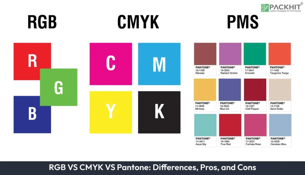
RGB, CMYK, and Pantone are the three primary color systems used across digital design, commercial printing, and brand color management, each differing in color creation method, color accuracy, gamut, file preparation, and intended applications. Each color model offers specific advantages, such as improved color reproduction, workflow suitability, and production efficiency for its intended applications. However, each also has limitations related to color range, consistency, printing costs, or compatibility, depending on the production method and end-use requirements.
Differences Between RGB, CMYK, and Pantone Color Systems
The key differences between RGB, CMYK, and Pantone color systems are outlined below:
Color Accuracy
RGB offers the widest color range and is best for displaying vibrant colors on digital screens. Colors can vary depending on the device, screen settings, and calibration. CMYK provides accurate results for standard printing, but its color range is smaller because it depends on physical inks. Pantone provides the most consistent color accuracy in professional printing because each Pantone color is a standardized, pre-mixed ink formula that can be reproduced consistently across different printers and materials.
Usage
RGB is used for digital designs, including websites, mobile applications, social media graphics, videos, and anything viewed on a screen. CMYK is used for traditional printing processes such as brochures, flyers, magazines, posters, and business cards. Pantone is mainly used for brand identity, logos, packaging, and professional printing projects where exact color matching is required.
Color Creation Method
RGB uses an additive color model, where red, green, and blue light are combined to create colors. More light creates brighter colors, and combining all three produces white. CMYK uses a subtractive color model, where cyan, magenta, yellow, and black inks absorb light to create printed colors. Pantone uses a spot color system, where specific colors are created using pre-mixed inks rather than being produced by combining CMYK inks.
Color Range (Gamut)
RGB has the largest color gamut and can display many bright and saturated colors that cannot be reproduced in print. CMYK has a more limited color gamut because printing inks cannot create the same intensity as light-based colors. Pantone provides a controlled library of colors, including many shades that may not be achievable using standard CMYK printing.
File Preparation
RGB files should be used when designing for screens, digital media, websites, and online content. CMYK files should be used when preparing artwork for most commercial printing to ensure the printed output matches expectations. Pantone colors should be used when a project requires exact color reproduction, such as a company logo, product packaging, or branded materials.
The following table provides a concise comparison of RGB, CMYK, and Pantone for quick understanding.
| Feature | RGB | CMYK | Pantone |
|---|---|---|---|
| Full Form | Red, Green, Blue | Cyan, Magenta, Yellow, Key (Black) | Pantone Matching System |
| Color Type | Additive (light-based) | Subtractive (ink-based) | Standardized ink color system |
| Main Use | Digital screens | Printing materials | Accurate brand and print colors |
| Best For | Websites, apps, displays | Brochures, posters, packaging | Logos, branding, exact color matching |
| Color Creation | Uses light combinations | Uses ink combinations | Uses pre-mixed standardized colors |
| Color Accuracy | Depends on screen settings | Depends on printing process | Highest color consistency |
| Common Format | RGB values, HEX codes | CMYK percentages | Pantone color codes |
| Color Range | Wider and brighter | More limited than RGB | Specific controlled shades |
Understanding these differences helps designers choose the correct color system based on whether their work will appear on a digital screen, printed material, or require exact brand color consistency.
What are the Pros and Cons of RGB, CMYK, and Pantone?
The pros and cons of RGB, CMYK, and Pantone are given below:
| Color System | Pros | Cons |
|---|---|---|
| RGB | Produces highly vibrant colors because it is light-based. Supports a broad color gamut for rich visual content. Widely supported across digital devices and design software. | Appearance may vary between displays due to differences in calibration and screen technology. Colors often require adjustment when converted for print. |
| CMYK | Uses standard printing inks compatible with most commercial presses. Produces predictable print results when files are prepared correctly. Cost-effective for full-color print production. | Cannot reproduce some highly saturated RGB and Pantone colors like print. Final appearance can be influenced by paper type, ink density, and printing conditions. |
| Pantone | Delivers highly consistent spot colors across different print runs. Offers specialty inks such as metallic, fluorescent, and premium finishes that are unavailable in standard CMYK printing. Simplifies color consistency for multi-vendor production. | Increases printing costs because additional spot inks may be required. Less practical for artwork containing many different colors, where process-color printing is generally more economical. |
How to Choose the Right Color Model for Custom Packaging?
The appropriate color model depends on the packaging project’s production requirements. For most commercial packaging, CMYK provides an efficient solution for full-color printing, while Pantone is preferred when precise spot colors or brand-specific color consistency are required. RGB remains useful during the design stage for digital mockups and on-screen presentations but should be converted to a print-ready color format before production. Selecting the appropriate color model early in the design process helps streamline file preparation and supports an efficient packaging production workflow.