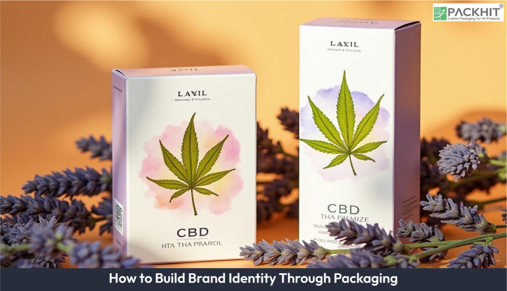
To effectively build brand identity, businesses must define visual elements, place the logo strategically, select materials aligned with their values, design for protection and unboxing appeal, and refine packaging through testing. Brand identity in packaging refers to the use of visual and structural elements such as logos, typography, color palettes, imagery, and materials to convey a brand’s personality, values, and mission. Core components include a recognizable logo, consistent fonts, brand-specific colors, engaging visuals, a clear brand name, and a memorable tagline, all working together to create a cohesive impression.
- What is Brand Identity in Packaging?
- Core Components of Brand Identity
- How to Build Brand Identity Through Packaging?
- 1. Define Core Visual Elements
- 2. Put the Logo Where People Can See It
- 3. Choose Materials That Match Brand Values
- 4. Design for Protection and First Impressions
- 5. Test, Measure, and Refine
- Choose Packaging Elements According to the Identity Goal
- Why is Custom Packaging Important for Brand Identity?
- Enhance Brand Recognition
- Create Emotional Connections
- Support Market Differentiation
- Communicate Brand Values
- Elevate the Customer Experience
- How Does Sustainable Packaging Affect Brand Identity?
- How Does Packaging Differentiate Brands in Competitive Markets?
What is Brand Identity in Packaging?
Brand identity in packaging is the combination of visual, verbal, and structural elements that shows customers who a brand is and what it stands for. Logos, typography, colors, imagery, materials, finishes, and packaging structure work together to create a consistent look and feel. When these elements are used consistently across products, they can make the brand easier to recognize and help communicate qualities such as trust, simplicity, sustainability, or luxury.
Core Components of Brand Identity
The core components of brand identity in packaging include:
Brand Logo: The logo is one of the strongest recognition cues on packaging. Its size, position, contrast, and clear space affect how quickly customers can identify the brand. A logo placed prominently on the main display panel is usually easier to notice, while inconsistent placement or an overly small logo can weaken recognition across different products.
Typography: Fonts communicate both information and personality. Serif typefaces may support a traditional or premium identity, while clean sans-serif fonts can create a modern or straightforward appearance. Typography must also remain readable at the final printed size. Thin strokes, small text, poor contrast, or unsuitable printing methods can make important information difficult to read.
Color Palette: Consistent colors help customers connect different products with the same brand. A controlled palette can also support intended associations, such as bold colors for an energetic identity or restrained neutral tones for a minimalist one. However, colors can shift between substrates and printing processes, so approved color specifications and print proofs help maintain consistency.
Imagery: Illustrations, photographs, patterns, and graphics shape how customers interpret the product and its personality. Minimal line illustrations may suit a simple or natural brand, while expressive graphics can support a youthful or playful identity. Imagery should complement the logo and typography rather than compete with them for attention.
Brand Name: The brand name should appear where customers can identify it quickly, particularly on the primary display panel. Its scale, spacing, and contrast should remain consistent across packaging formats so customers do not have to relearn the brand from one product to another.
Tagline: A tagline summarizes an important promise, positioning idea, or brand message. It works best when it remains short, readable, and clearly separated from mandatory product information.
Tone of Voice: Product descriptions, instructions, claims, and short messages on the package should reflect the same communication style used elsewhere by the brand. A technical brand may use precise wording, while a friendly consumer brand may use more conversational language.
Materials and Finishes: The physical feel of packaging can reinforce the identity customers see visually. Heavier or rigid stocks, embossing, foil stamping, or selective finishes may support premium positioning, while recycled fiber, uncoated surfaces, and visible paper texture may suit a natural or sustainability-focused identity. These choices work only when they also meet product-protection, printing, cost, and production requirements.
How to Build Brand Identity Through Packaging?
To build brand identity through packaging, define the visual system first, apply it consistently to visible packaging areas, select materials and finishes that support the intended positioning, design the structure around product protection and customer experience, and verify the result through print proofs and physical samples.
1. Define Core Visual Elements
Start by specifying the logo, typefaces, color palette, imagery style, and rules for how each element should appear on packaging. Assign primary, secondary, and accent colors instead of choosing colors independently for every product.
Match these choices to the identity the brand wants to communicate. A restrained palette and carefully spaced typography may support a premium or minimalist identity, while stronger contrast and expressive graphics may suit a more energetic brand. The visual choice alone is not enough; it must remain recognizable when printed at the actual packaging size.
Record production specifications such as Pantone, CMYK, or other appropriate print color values, minimum logo dimensions, clear space, typography sizes, and artwork requirements. Provide vector artwork and print-ready files for dielines, with separate production layers where embossing, foil stamping, varnish, or other finishes are required.
These specifications help prevent a common problem: packaging that looks correct on screen but changes during production because printers, converters, or suppliers interpret the artwork differently.
2. Put the Logo Where People Can See It
Place the primary logo on the panel most likely to face the shopper, recipient, or camera. For a retail box, this is usually the main display panel. For e-commerce packaging, the top panel, opening flap, or interior surface may provide additional branding opportunities.
Visibility depends on more than placement. The logo needs enough contrast, clear space, and printed size to remain recognizable at normal viewing distance. Placing a detailed logo too close to folds, cut lines, textured materials, or complex graphics can reduce clarity.
Secondary logos or wordmarks can appear on side panels or interior flaps when they support the viewing sequence without creating unnecessary repetition.
Printing and finishing methods should also match the artwork and production conditions. Digital printing can suit shorter runs or frequently changing artwork, while flexographic or offset processes may become more practical at larger volumes depending on the substrate, number of colors, setup costs, and required print quality. A printer or converter should confirm the most suitable process rather than relying on a fixed quantity threshold.
3. Choose Materials That Match Brand Values
Material choice affects both how the package performs and how customers perceive it. Kraft and recycled fiber can communicate a natural or sustainability-focused identity when their appearance and disposal route support that message. Smooth coated paperboard can reproduce detailed graphics and strong colors more precisely, while uncoated stock creates a softer, more tactile surface.
Premium positioning may benefit from greater rigidity, heavier board, textured stocks, or carefully controlled finishes, but weight alone does not create a premium experience. Weak folds, poor print registration, visible glue marks, or inconsistent finishes can undermine the intended effect.
For shipping protection, corrugated board should be selected according to product weight, fragility, distribution conditions, and structural requirements. Thinner flute profiles can suit compact retail-style packs, while larger or stronger constructions may be needed where cushioning and stacking strength matter more.
Material claims should also match the actual packaging structure. A brand promoting sustainability can create a credibility gap if recyclable fiber is combined with coatings, laminations, adhesives, or mixed materials that make disposal difficult. Disposal instructions should therefore reflect the real material combination and available recovery route.
4. Design for Protection and First Impressions
Packaging has to communicate the brand without compromising its primary job: protecting the product. Start with the product dimensions, weight, fragility, storage conditions, and distribution environment before adding decorative details.
Orient the box so the main brand panel appears correctly during display or delivery. Use inserts such as molded pulp, paper dividers, or other protective structures where movement could cause damage.
Finishes can then reinforce the intended identity. Embossing can add tactile emphasis to a logo, foil can create reflective contrast, and spot UV can highlight selected graphics. These effects are most effective when used with a clear purpose rather than across every available surface.
Production compatibility matters. Fine embossing may lose definition on unsuitable board, foil may not reproduce cleanly over complex textures, and soft-touch coatings can change the appearance of printed colors. Physical finish samples and prototypes can reveal these problems before a full production run.
5. Test, Measure, and Refine
Test packaging with printed prototypes rather than judging it only from digital mockups. Check logo visibility, typography, color accuracy, folding, material feel, structural protection, and finish quality under conditions similar to actual use.
Common warning signs include:
- colors that change noticeably between samples or product variants
- text that becomes difficult to read at final size
- logos that disappear into graphics or textured surfaces
- foil, varnish, or embossing that does not align with the artwork
- materials that feel inconsistent with the intended positioning
- weak visual hierarchy that makes the brand difficult to identify quickly
- packaging damage that undermines the intended customer experience
These problems can often be reduced through print proofs, approved color samples, material prototypes, dieline checks, supplier specifications, and documented production tolerances.
Customer testing can add another layer of evidence. Depending on the objective, measure brand recall, perceived quality, ease of identifying the product, unboxing feedback, damage rates, or return reasons. Use the findings to adjust graphics, materials, structure, or finishes before finalizing the system across more products.
Choose Packaging Elements According to the Identity Goal
There is no single material, finish, or layout that works for every brand. The right choice depends on the identity being communicated and the conditions under which the packaging will be produced and used.
For a luxury identity, rigid or heavier stocks, restrained layouts, embossing, foil, or carefully selected tactile finishes can support perceived quality when production can maintain accurate registration and consistent finishing.
For a trust-focused identity, clear typography, high contrast, straightforward information hierarchy, consistent colors, and familiar structural cues may matter more than decorative effects.
For a natural or sustainability-focused identity, recycled fiber, uncoated textures, reduced coatings, and simpler finishes can reinforce the message when the materials still provide suitable product protection and realistic end-of-life options.
For a bold or youthful identity, strong color contrast, expressive typography, illustrations, and graphic patterns can create distinction, provided the brand name and essential information remain readable across different package sizes.
For a minimal identity, fewer graphics, controlled spacing, restrained colors, and careful typography place greater attention on execution. Small alignment errors, color shifts, weak folds, or poor printing become more noticeable because there are fewer visual elements to hide them.
Before approving any option, consider substrate compatibility, printing method, finish tolerances, product protection, production quantity, cost, supplier capability, and the need to reproduce the same identity across multiple SKUs.
A clear production handoff should therefore include approved artwork, dielines, color specifications, font information, logo rules, material grades, finish instructions, print proofs, physical samples, and relevant tolerances. These controls help the manufactured package stay consistent with the identity approved during design.
Why is Custom Packaging Important for Brand Identity?
Custom packaging gives a brand control over the visual, physical, and structural cues customers use to identify a product. Its value comes from maintaining the same identity across repeated customer interactions rather than simply making the package look different.
Enhance Brand Recognition
Consistent logos, colors, typography, and layouts can make related products easier to identify across shelves, deliveries, websites, and social content. Recognition becomes weaker when colors, fonts, logo proportions, or placement change substantially between SKUs.
A documented packaging system helps prevent this inconsistency by defining how core brand elements should appear across different box sizes and product formats.
Create Emotional Connections
Materials, colors, imagery, wording, and opening experience can influence how customers interpret a brand. A rigid board with restrained graphics may support a premium impression, while tactile recycled paper and simple printing may feel more natural or understated.
The effect depends on consistency. A carefully designed luxury identity can lose credibility when customers receive a poorly assembled box, while sustainability messaging can feel contradictory when the package contains excessive or difficult-to-recycle components.
Support Market Differentiation
Distinctive structures, graphics, finishes, and material combinations can help a product stand apart from visually similar competitors. Differentiation should still preserve clarity. Excessive decoration, competing graphics, or too many finishes can make the brand name and product information harder to identify.
Distinctive packaging therefore works best when the design gives the brand a recognizable feature without weakening hierarchy, usability, or production consistency.
Communicate Brand Values
Packaging provides physical evidence of the values a brand claims to represent. A sustainability-focused company may use recyclable fiber, reduced material, simpler coatings, or refillable structures. A premium brand may focus on precision, rigidity, restrained graphics, and controlled tactile finishes.
Material and finish choices should support the claim in practice. The strongest identity comes from alignment between the message, the physical package, and the way it is produced.
Elevate the Customer Experience
Packaging shapes the customer’s experience from first sight to opening and disposal. Clear opening points, well-positioned branding, protective inserts, organized product presentation, and considered materials can make the experience feel more intentional.
For e-commerce brands, this stage is especially important because the shipping package may be the customer’s first physical contact with the brand. The experience can support brand perception, but it should not come at the cost of unnecessary materials, difficult opening, or inadequate product protection.
How Does Sustainable Packaging Affect Brand Identity?
Sustainable packaging affects brand identity by shaping what customers notice on first touch, through visible materials, consistent labeling, and reduced waste signals.
How Does Packaging Differentiate Brands in Competitive Markets?
Packaging differentiates brands by making the visual system consistent across custom logos, colors, and box structures, so shoppers can identify the brand faster when the logo is readable at typical display/thumbnail distance and matches approved print proofs across SKUs.