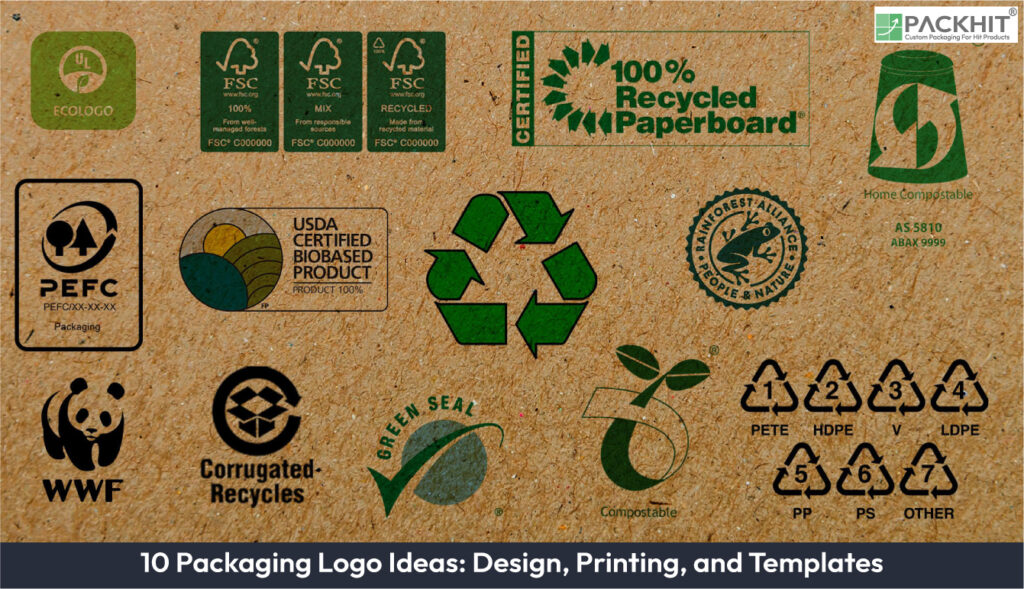
Packaging logos serve as critical visual identifiers for brands, combining design aesthetics, printing techniques, and template adaptability to create impactful branding on product packaging. Packaging logo ideas can be categorized into three primary approaches: design, printing, and templates. Design-focused logos emphasize visual storytelling through minimalism, iconic symbols, or typography, ensuring they align with brand identity. Printing techniques such as embossing, foil stamping, and digital printing add texture, vibrancy, and precision to logo applications, enhancing both functionality and appeal. Templates offer scalable and adaptable solutions, allowing logos to be seamlessly incorporated into various packaging formats, from labels and die-cuts to wraparound designs. These strategies provide manufacturers with diverse options to create impactful, recognizable packaging logos tailored to their products and consumer preferences.
The ten packaging logo ideas below cover design, printing, and template-based approaches. The best option depends on how the logo needs to reproduce, the packaging material, available print area, production method, and whether structural or interactive features are required.
- 1. Minimalist Logo Designs
- 2. Symbol-Based Logos
- 3. Typography-Driven Logos
- 4. Embossing and Debossing
- 5. Foil Stamping
- 6. Digital Printing
- 7. Die-Cut Templates
- 8. Label Templates
- 9. Wraparound Templates
- 10. Interactive Templates
- How Should a Packaging Logo Be Prepared for Production?
- Packaging Logo Selection Guide For Manufacturers
- How Can Manufacturers Optimize Packaging Logo Strategies?
1. Minimalist Logo Designs
Minimalist logos use clean lines, geometric shapes, and limited color palettes. Prioritize this approach when the same logo must remain recognizable across different package sizes or restricted print areas. Fine lines and very small elements can still lose definition, so manufacturers should test the design at its smallest intended print size.
2. Symbol-Based Logos
Symbol-based logos use recognizable imagery, such as leaves, water droplets, or abstract shapes. They are useful when a compact brand mark needs to work on labels, pouches, boxes, and other formats with different amounts of available space. Choose a simpler symbol over a highly detailed one when the logo will frequently appear at small sizes.
3. Typography-Driven Logos
Typography-driven logos make the brand name or lettering the main visual element. This approach is worth prioritizing when name recognition is more important than a separate symbol. However, narrow spacing, fine strokes, and elaborate letterforms can become difficult to reproduce at small sizes, making print testing important before production.
4. Embossing and Debossing
Embossing raises a logo from the packaging surface, while debossing creates a recessed impression. These methods are useful when tactile depth is part of the intended package presentation and the substrate can withstand the forming process. They are less appropriate when the material is too thin or prone to cracking, so manufacturers should evaluate material thickness, die alignment, and impression depth on a prototype.
5. Foil Stamping
Foil stamping transfers metallic, pigmented, or holographic foil onto selected logo areas using heat and pressure. Prioritize foil when reflective contrast is an intentional part of the logo presentation rather than when straightforward color reproduction is the main requirement. Because adhesion and transfer quality depend on the substrate, coating, heat, and pressure, a production sample should be checked for incomplete coverage, flaking, and misalignment.
6. Digital Printing
Digital printing reproduces logo artwork directly from a digital file and supports detailed graphics, multiple colors, and variable artwork. It is particularly useful when designs change between versions or when variable elements are required. For logos that depend on exact spot effects, tactile finishes, or structural impressions, another process may be more appropriate. Printed samples should be checked for color, fine-detail reproduction, and resistance to normal handling.
7. Die-Cut Templates
Die-cut templates incorporate logo shapes into windows, openings, or other structural package features. Choose this approach when the logo itself should contribute to the package structure or reveal part of the product. Because cuts near folds, seams, or narrow sections can affect both appearance and structural integrity, manufacturers should evaluate the assembled package rather than approving the flat template alone.
8. Label Templates
Label templates allow a logo system to be applied across bottles, jars, pouches, boxes, and other packaging without making the logo part of the package structure. They are a practical choice when the same branding must adapt to several container formats. Surface texture, moisture, temperature, and storage conditions can affect adhesion, so label stock and adhesive should be matched to the application.
9. Wraparound Templates
Wraparound templates extend logos and supporting artwork around cylindrical containers or across multiple package surfaces. They work best when continuous surface coverage is more important than keeping every design element on a single panel. Important logo elements should be positioned away from problematic seams or overlaps, and an assembled sample should be inspected for alignment before production.
10. Interactive Templates
Interactive templates incorporate QR codes, AR markers, or other scannable elements into the packaging design. Prioritize them when the package needs to direct users to digital instructions, product information, registration, or other online content. They should not replace information that must remain immediately accessible on the physical package. Size, contrast, clear space, placement, and scan performance should all be tested on the finished packaging.
How Should a Packaging Logo Be Prepared for Production?
Start with artwork that matches the intended printing or finishing method. Check logo dimensions, line thickness, text size, color setup, and placement against the package layout. For techniques such as embossing, foil stamping, die-cutting, or wraparound designs, account for folds, seams, cut areas, and other structural features that could affect the finished logo. Providing production-ready artwork with clearly defined dimensions and placement helps translate the approved design into the final packaging.
Packaging Logo Selection Guide For Manufacturers
Packaging logo selection guide for manufacturers: choose a logo style that matches the package material, printing method, and brand placement area, so the mark stays legible from shipping labels to retail faces.
| Approach | Best Used When | Check Before Production |
|---|---|---|
| Minimalist or symbol design | Logo must remain clear across sizes | Fine details and readability |
| Typography-driven design | Brand name is the main identifier | Letter spacing and print clarity |
| Embossing/debossing | Tactile depth is required | Material thickness and impression quality |
| Foil stamping | Reflective or metallic detail is required | Foil adhesion and alignment |
| Digital printing | Detailed or variable artwork is needed | Color and print consistency |
| Label/wraparound templates | Branding spans multiple formats | Placement, seams, and adhesion |
| Die-cut templates | Logo interacts with package structure | Cut alignment and structural strength |
| Interactive templates | Logo links to digital content | QR/marker size, contrast, and scanning |
After choosing an approach, validate basic legibility and alignment on the intended packaging before moving forward.
How Can Manufacturers Optimize Packaging Logo Strategies?
Manufacturers should choose packaging logo techniques according to the role the logo needs to perform, rather than treating every method as interchangeable.
- For adaptable visual identity: Minimalist, symbol-based, and typography-driven designs work across different packaging formats, with the choice depending on available space and required detail.
- For surface finishes: Embossing/debossing adds tactile depth, while foil stamping adds reflective or metallic detail. Both depend more heavily on substrate characteristics than standard printed designs.
- For variable artwork: Digital printing is useful when designs, colors, or other graphic elements need to change between versions.
- For consistent application: Label and wraparound templates help control logo placement across different containers or package surfaces.
- For structural integration: Die-cut templates are appropriate when the logo becomes part of a window, opening, or other package feature.
- For digital interaction: Interactive templates suit applications where QR codes or scannable elements connect physical packaging with digital content.
The most suitable approach depends on whether the priority is visual consistency, tactile or reflective finishing, variable printing, structural integration, or digital functionality.